Visual Identity — Designer/Creative Director
The brand evolution for SPL Washrooms focuses on clarity, functionality, and a refined visual language that fits the architectural spaces their products serve. The updated logo is a cleaner, more confident version of the original, signalling progress while maintaining recognition.


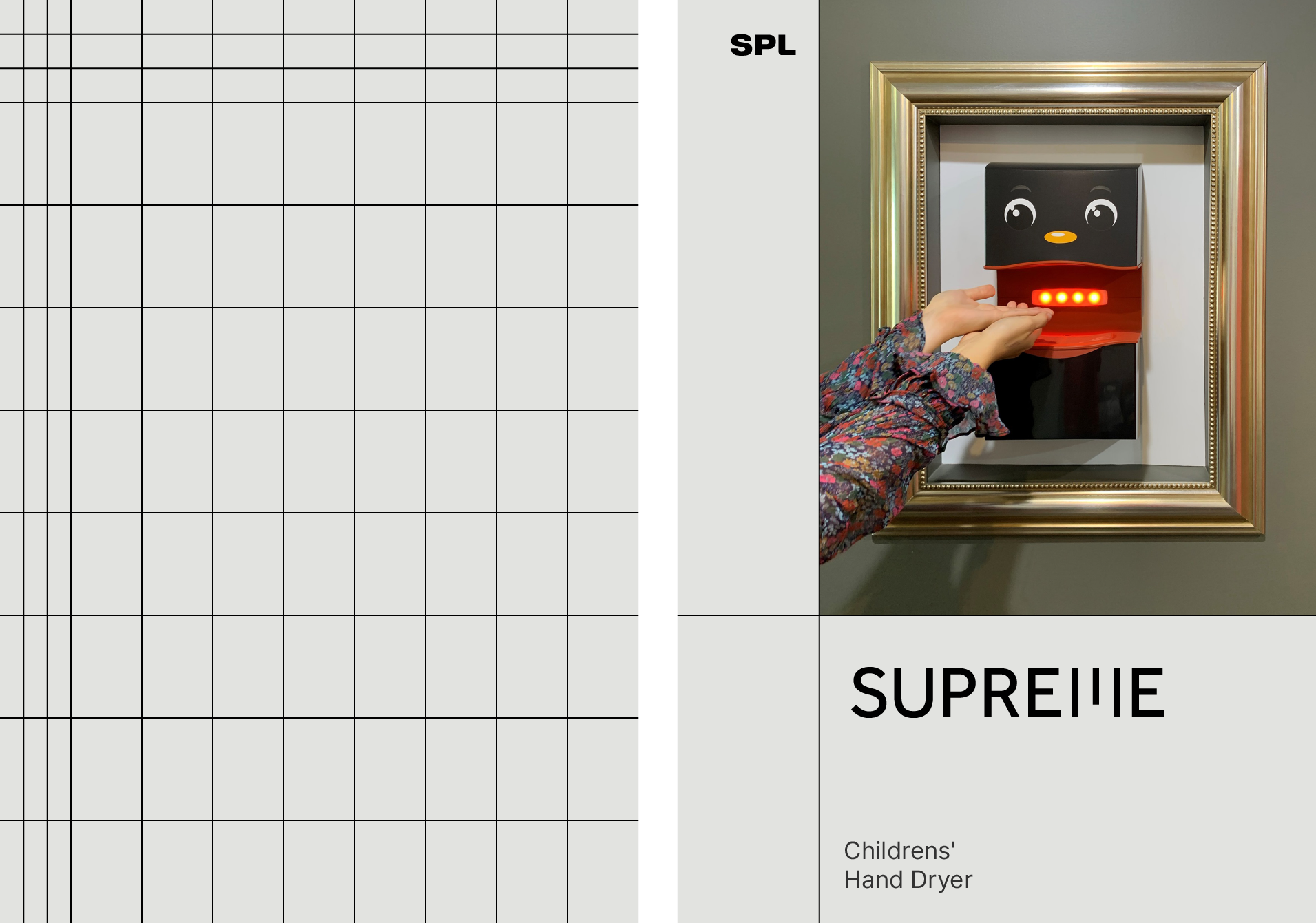
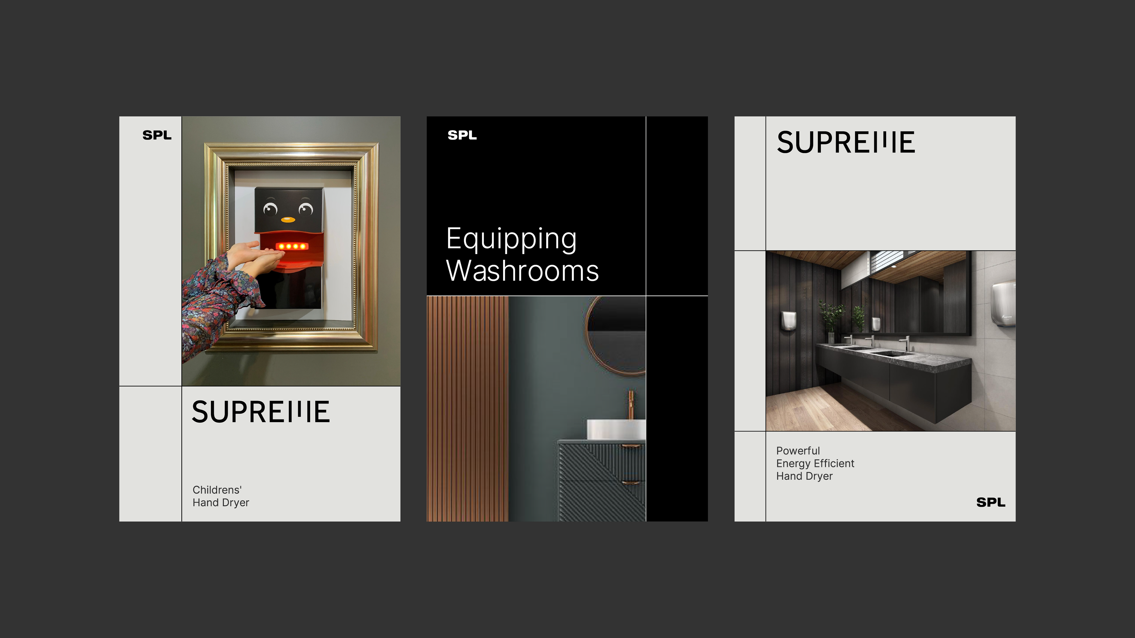
The visual identity is built on a 3x3 grid system that uses lines to structure space for images, specs, and type. These lines hint at floor plans and tiling, reinforcing the brand’s architectural relevance. A black-and-white palette provides a neutral backdrop that highlights products and imagery.
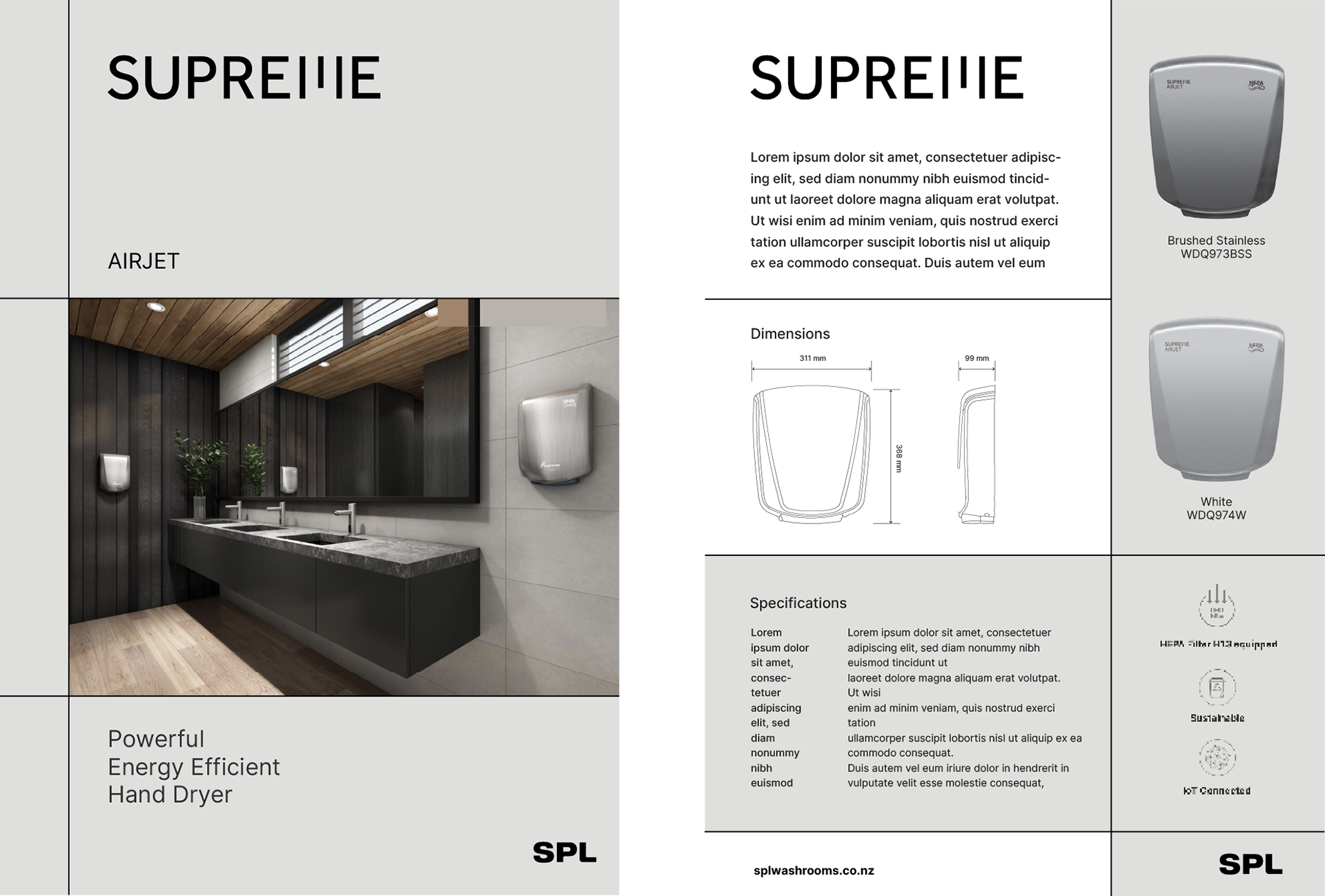
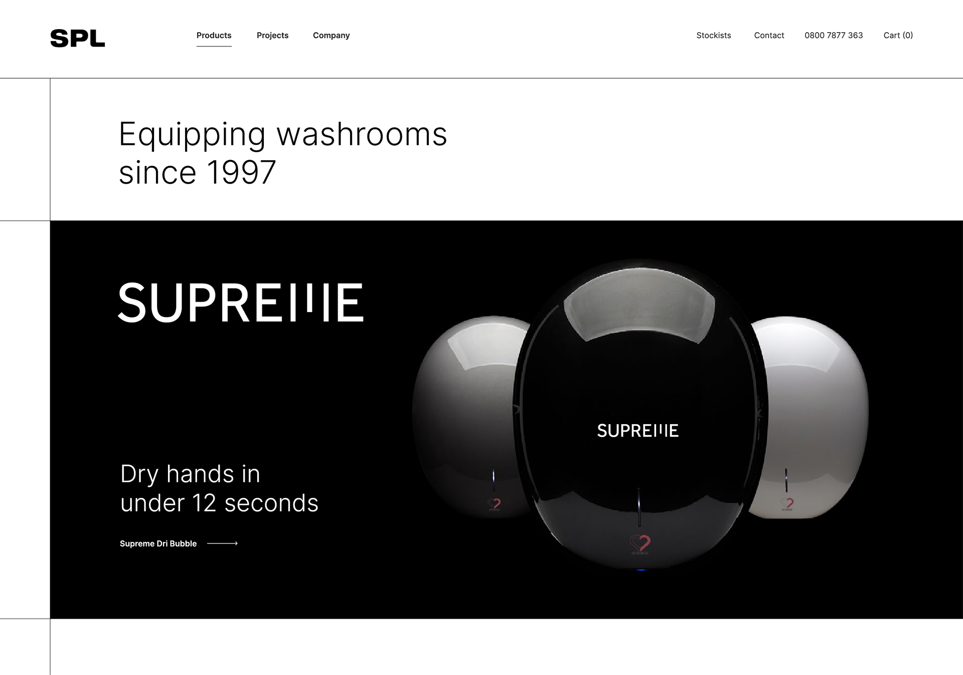
SPL’s flagship product, Supreme, features a reworked wordmark where the letter ‘m’ echoes the force of a hand dryer in action.